The HTML5 data attribute With the introduction of HTML5, JavaScript developers have been blessed with…
Create an awesome metallic navigation bar with CSS only

A couple of days ago I stumbled upon this absolutely amazing dribbble shot by Alex Takahashi. After studying the details I realized that one must be able to recreate this metallic navigation bar using only CSS. It took me a couple of hours and I think it’s worth sharing the process with you. Yay!
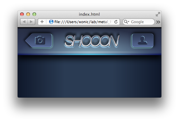
The final result
Check out the live demo or the final CSS code on GitHub.
Note: This tutorial covers only newer Browsers such as Safari 5, Chrome 10+ and Firefox 10+. Unfortunately it is not yet possible to apply a color gradient to text in Firefox, so the best result can only be seen with Safari or Chrome.
Things we need
Well, there isn’t really much to it, except for three things:
- normalize.css, a really neat little CSS file that makes browsers render elements more consistently.
- Font Awesome, an iconic font which enables us to include perfectly scalable vector icons, such as the camera and user icon.
- Your favorite text editor. I’m using Sublime Text 2 but any proper text editor will do the job just fine.
Let’s get started with some basic HTML
  <div class="menubar">
    <div class="container">
      <div class="btn btn-left">
        <div class="back"></div>
        <i></i>
      </div>
      <h1>Shooon</h1>
      <div class="btn btn-right">
        <i></i>
      </div>
    </div>
  </div>
First of all — the HTML isn’t very semantic and one should definitely avoid meaningless structure out in the wild, but for the sake of this tutorial I think we might get away with it. Shhh, just don’t tell anyone. Please.
So, now that we’ve set things clear, let’s have a closer look. Inside the tag we load the necessary stylesheets (base.css is where we put our stuff). We’re simply using a bunch of div elements as containers. There is one for the .menubar itself, a .container used as a wrapper to center the three elements, two .btn for each of our buttons and finally the i elements, which represent the icons.
There is also a h1 tag, containing the type “Shooon” which I guess is the name of the iPhone app. You might have noticed the .back element I forgot to mention. Well that little but special fella will help us giving the back button its unique “iPhone-Back-Button-Shape”. More on that in a second.
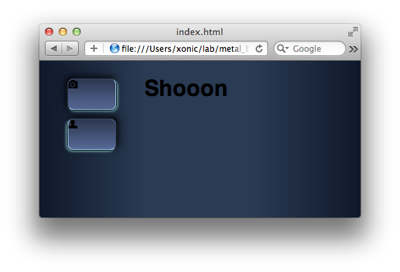
Here’s what we have so far:

We see that the icons have already been inserted for us, just by giving the elements the corresponding class name — (font)awesome!
Enter CSS Magic
Before we get down the the real business, let’s set up the right mood with the following basic CSS:
body
{
  background: -webkit-linear-gradient(left,  #0f182b 0%,#2a3b53 33%,#2a3b53 66%,#0f182b 100%);
}
This sets the dark background and simulates some light. Now for the buttons!
.btn
{
  position:relative;
  margin:4px 40px;
  float:left;
  width:70px;
  height:45px;
  border:1px solid black;
  border-radius:8px;
  background:-webkit-linear-gradient(top,  #2c354e 0%,#576a97 100%);
  z-index:2;
}
The document should now look like this:

So we just gave the .btn class some margins and set width and height. Making the buttons float is one technique to get the elements positioned next to each other. For now that’s not gonna happen, since the h1 element isn’t floating but we’ll fix that later.
We’ve also added a black border and nicely rounded corners, as well as a simple linear gradient from top to bottom.
Two important rules are position:relative; because we’ll give child elements an absolute positioning and z-index:2; because we’ll insert a pseudo element above and below the button element.
So far so good, let’s add light and shadows:
.btn-left
{
  box-shadow:-2px -2px 9px rgba(0, 0, 0, 0.7),
         -4px -4px 20px rgba(0, 0, 0, 0.4);
}

.btn-right
{
  box-shadow:2px -2px 9px rgba(0, 0, 0, 0.7),
         4px -4px 20px rgba(0, 0, 0, 0.4);
}

.btn::before
{
  content:"";
  position: absolute;
  top:0;
  right:0;
  bottom:0;
  left:0;
  border-top:1px solid #3E4970;
  border-bottom:1px solid #a7ddff;
  border-radius:8px;
  z-index:3;
}

.btn-left::before
{
  border-left:1px solid #3E4970;
  border-right:1px solid #a7ddff;
}

.btn-right::before
{
  border-right:1px solid #3E4970;
  border-left:1px solid #a7ddff;
}

.btn::after
{
  content:"";
  position:absolute;
  top:1px;
  bottom:-1px;
  border-radius:9px;
  z-index:1;
}

.btn-left::after
{
  right:-1px;
  left:1px;
  box-shadow:1px 1px 5px rgba(171, 255, 255, 0.8);
}

.btn-right::after
{
  right:1px;
  left:-1px;
  box-shadow:-1px 1px 5px rgba(171, 255, 255, 0.8);
}
Ok, this one’s long but let’s see what we just did. As you may have noticed, our buttons have two individual classes .btn-left and .btn-right, since they need individual styles applied. With the first two selectors we add a nice dark shadow on top of the buttons.
Both buttons need a .btn::before and a .btn::after pseudo element which allows us to use one selector to apply shared rules and four more selectors .btn-right::before, .btn-left::before, .btn-right::after and .btn-left::after to apply the individual rules.
Essentially the ::before elements are used to simulate the inner, sharp highlights and the ::after elements simulate the outer soft highlight. We can now see, why it is important for the ::after elements to have a lower z-order than the actual element itself because if it was otherwise, the outer blue highlight would overlap the black border of the button.
This is what it looks like so far:
Ok, let’s see how we can manipulate the back button to give it the well known “iPhone-Back-Button-Shape”.
.back
{
  position:relative;
  top:6px;
  left:-12px;
  background:gray;
  width:33px;
  height:33px;
  -webkit-transform:rotate(45deg);
  background: -webkit-linear-gradient(left top,  #2c354e 0%,#576a97 100%);
  z-index:4;
  border-radius: 3px;
  border-left: 1px solid black;
  border-bottom: 1px solid black;
  box-shadow: -5px 2px 5px rgba(0, 0, 0, 0.4);
}

.back::before
{
  content:"";
  position:absolute;
  top:0;
  left:0;
  right:0;
  bottom:0;
  border-bottom:1px solid #7987B4;
  border-left:1px solid #475380;
  border-radius:3px;
}
The magic here happens on the inner div which gets rotated by 45 degrees and repositioned so that the shape comes together nicely. Since we apply the same color gradient from the top left corner to the bottom right corner as we applied to the button itself from top to bottom, the two elements fade into each other and are now recognized as a single element.
Again, the ::before element is used to simulate the inner sharp highlights.
Yay, we’re nearly done with our buttons:

But hey, the icons look shit and the camera is even hidden under the .back element. Let’s fix that!
.btn i[class^='icon-']
{
  font-size:2em;
  line-height:45px;
  position:absolute;
  top:0;
  left:0;
  bottom:0;
  text-align:center;
  color:#2B344E;
  z-index:6;
}

.btn i.icon-camera
{
  right: 8px;
  text-shadow: -1px -1px 0px rgba(167, 221, 255, .8),1px 1px 2px black;
}

.btn i.icon-user
{
  right: 3px;
  text-shadow: 1px -1px 0px rgba(167, 221, 255, .8),1px 1px 2px black;
}
The first selector may seem a little tricky, but all it does is fetch every element whose class attribute starts with “icon-“, namingly both our icons.
We doubled the font size and set an appropriate color. Through positioning absolute and setting the top, left, bottom values to zero the element stretches to fit its relative positioned parent. There is a little margin on the right values though, otherwise the icons would not be perceived perfectly centered.
Since the icons are not images but font characters, we’re able to apply a nice and neat text shadow to simulate the relief effect. Awesome, isn’t it?
Here we are, two lovely buttons:

h1
{
  position:relative;
  margin:0;
  width:3.7em;
  color: transparent;
  font: italic 3em "Helvetica Neue";
  font-weight:lighter;
  text-transform: uppercase;
  float: left;
  letter-spacing: -6px;
  text-shadow:-1px -1px 0 black, 1px 1px 0 black, -1px 0 0 black, 1px 0 0 black, 0 3px 4px rgba(167, 221, 255, 1), 0 -6px 7px rgba(0, 0, 0, 0.5);
}

h1::before
{
  content:"Shooon";
  text-transform:uppercase;
  position:absolute;
  color:#fff;
  left:0;
  right:0;
}

h1::after
{
  content:"Shooon";
  text-transform:uppercase;
  position:absolute;
  color:#525b73;
  -webkit-mask-image: -webkit-gradient(linear, left top, left bottom, from(rgba(0,0,0,1)), to(rgba(0,0,0,0)));
  left:0;
  right:0;
}
Great! We just styled our heading! By adding the unblurred text shadow we managed to get a nice black border on the text. The font is set to “Helvetica Neue” which, unfortunately, only comes pre-installed on Macintosh. So if you’re on a Windows machine you’re likely to see a different font.
Adding a gradient to the text itself is a bit of a tricky little task, but hey, no problem for us, right? In order to achieve the effect again we need to use our dear friends ::before and ::after. The text itself is set to transparent, the ::before element is positioned below and has a white color, while the ::after element lays on top and has a grey color. All the magic happens in this rule statement -webkit-mask-image, which masks the ::after element with a linear gradient such that the ::before element below can shine through… magic, isn’t it?
But, unfortunately, one pain in the *** still remains. It seems that WebKit has some rendering issues with multiple text-shadows which is why the last character looks a bit awkward. *Sigh*
Hey, we’re nearly done, woohoo!

.menubar
{
  position:relative;
  height:75px;
  padding-top:15px;
  box-shadow:0 12px 20px rgba(0,0,0,.9);
  background: -webkit-radial-gradient(center bottom, rgba(160, 201, 215, 0.8) 0%, rgba(160, 201, 215, 0) 70%), -webkit-linear-gradient(top, black 0%,#282F44 6%,#2C3551 52%,#354262 91%,#050C54 100%);
}

.container
{
  width:481px;
  margin:0 auto;
}
Ok, now we gave the .container the necessary width for the buttons to fit. The .menubar just got a proper height, a quite dark shadow and a linear top to bottom, as well as a radial bottom centered gradient.
Already looking great, ain’t it? But, well, there is one more tiny bit of tweaking we need, but then we’re done, I promise! So here goes:
.menubar::before
{
  content:"";
  position:absolute;
  background:-webkit-radial-gradient(center, rgba(66, 200, 239, 1) 0%, rgba(3, 171, 228, 0) 80%);
  bottom:0;
  top:85px;
  left:100px;
  right:100px;
}

.menubar::after
{
  content:"";
  position:absolute;
  background:-webkit-radial-gradient(center, rgba(255, 255, 255, 0.3) 0%, rgba(255, 255, 255, 0) 70%);
  bottom:5px;
  top:76px;
  left:40px;
  right:40px;
}
Again we use ::before and ::after and put them, absolutely positioned inside their parent, all down to the bottom of the menu bar. We make them very small in height but stretch them quite a bit. After applying a radial gradient to each of them, we have some very nice highlights that finish off our design with some great visual depth!
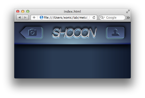
Here we are:
Well then, glad you made it all the way down here and I thank you very much for reading my tutorial. I hope it was as instructive and inspiring to you as it was to me.
And many thanks to Alex Takahashi, who came up with this great design in the first place.
Best,
Thomas
Was intersting to see how it been made with CSS 🙂
Thank you buddy!